PACKAGING REDESIGN & ANIMATED WEBSITE HEADER - PERSONAL PROJECT - JUNE 2023
ANIMATED WEBSITE HEADER
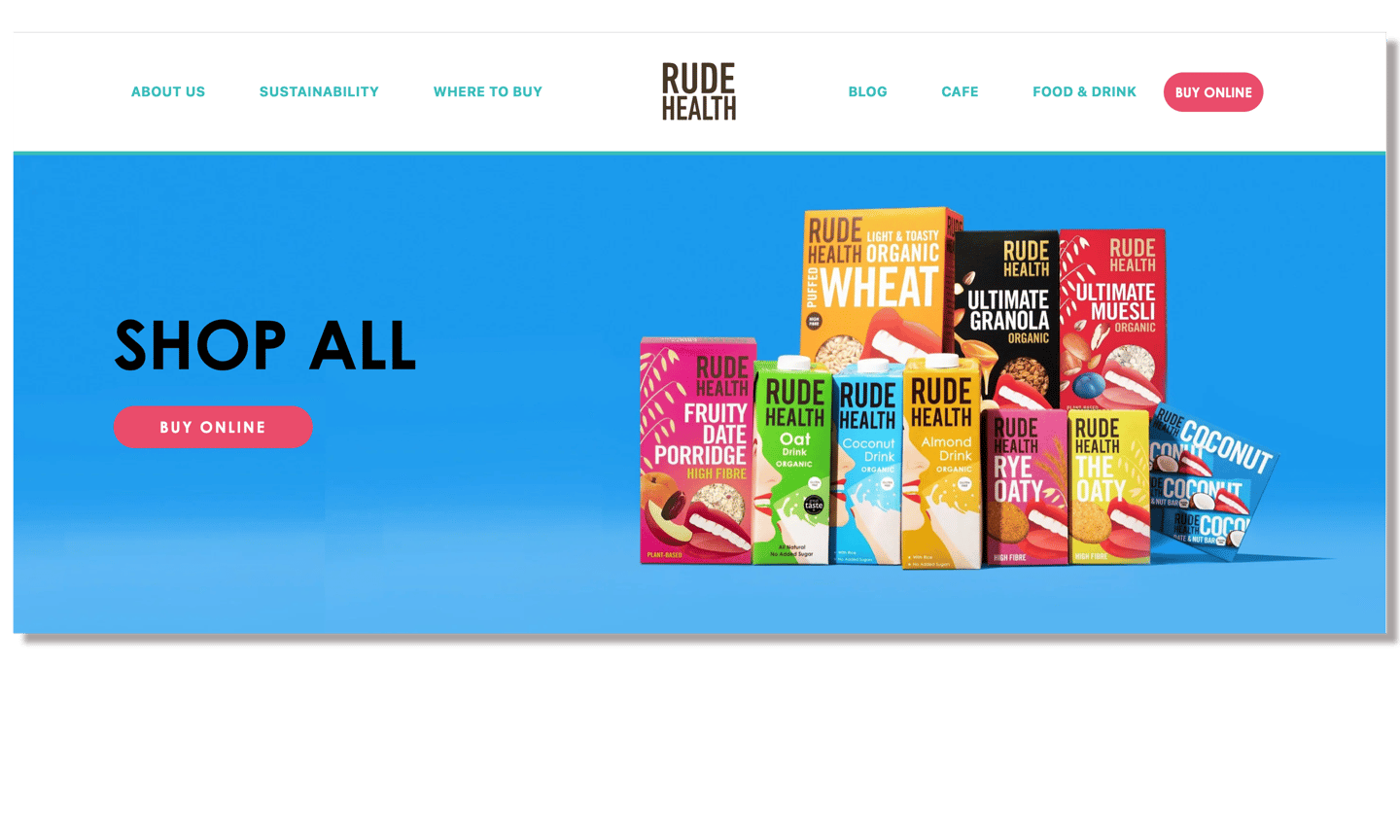
I created an animation for the website header on the rude health website.
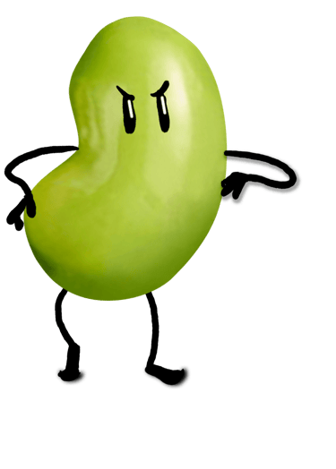
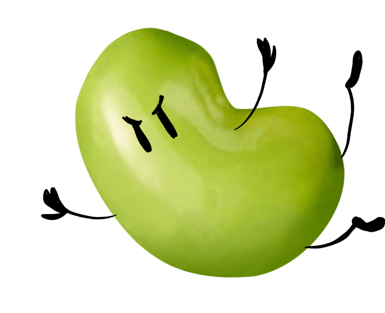
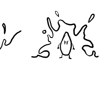
You see all the rude mascots walking towards you.
They are in a foul mood yet remain determined.
There's a milk explosion happening in the back.
They keep marching on.
The camera pans up and reveals the rude health logo on a bright blue sky.
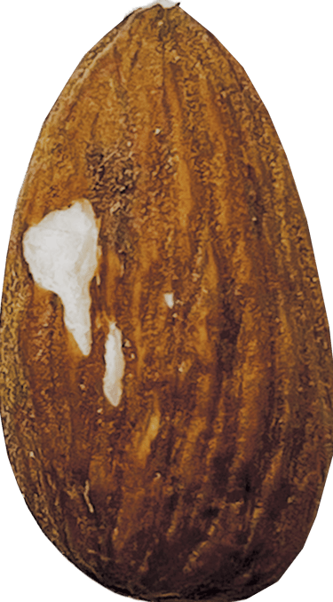
Our little nuts and beans are stern, perhaps a bit rude at times, but they are on a positive mission to promote a healthy and more sustainable lifestyle.
The idea with these simple yet poignant characters is that they can be spun off in many different ways to create content.
This can be done in trivial ways or to share snippets of information about environmentalism, recycling, and nutrition.
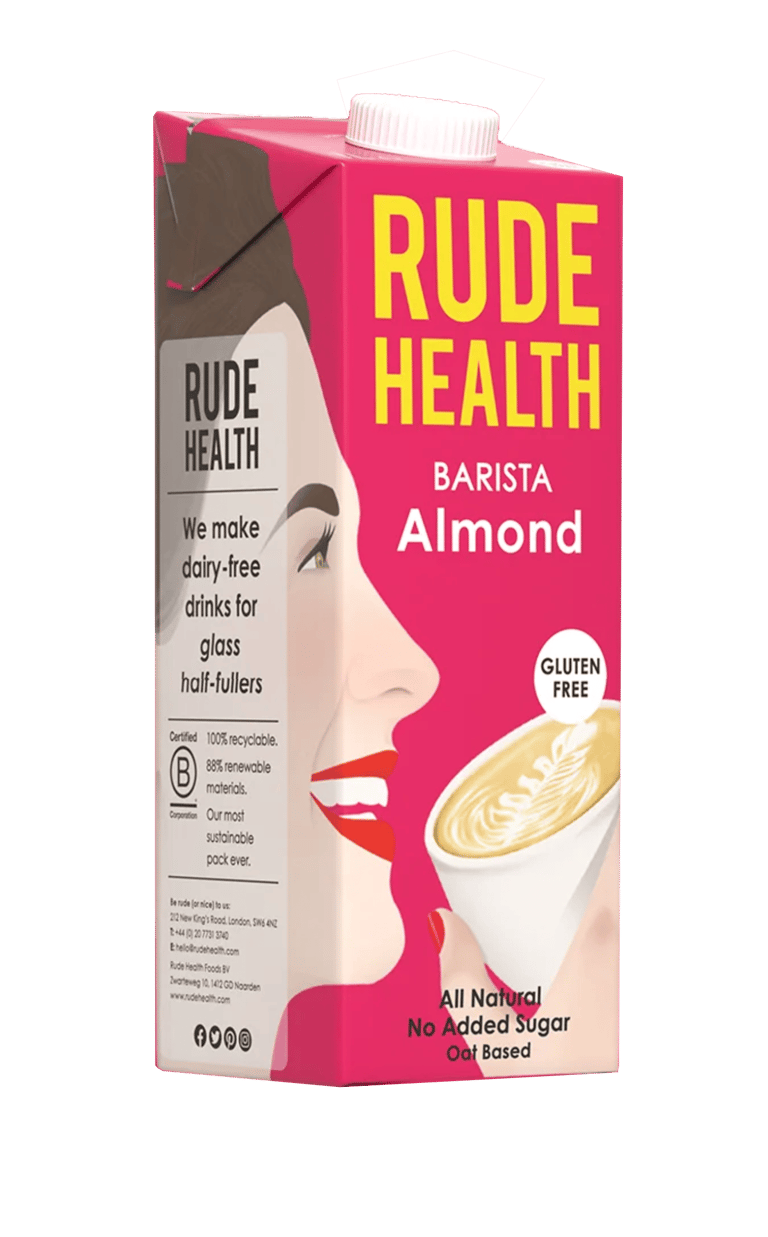
The colour scheme is a bit confusing and not very coherent.
I tried to find an easily identifiable colorway for each flavor and used darker and lighter shades for sub-categories of each flavour.
RUDE HEALTH
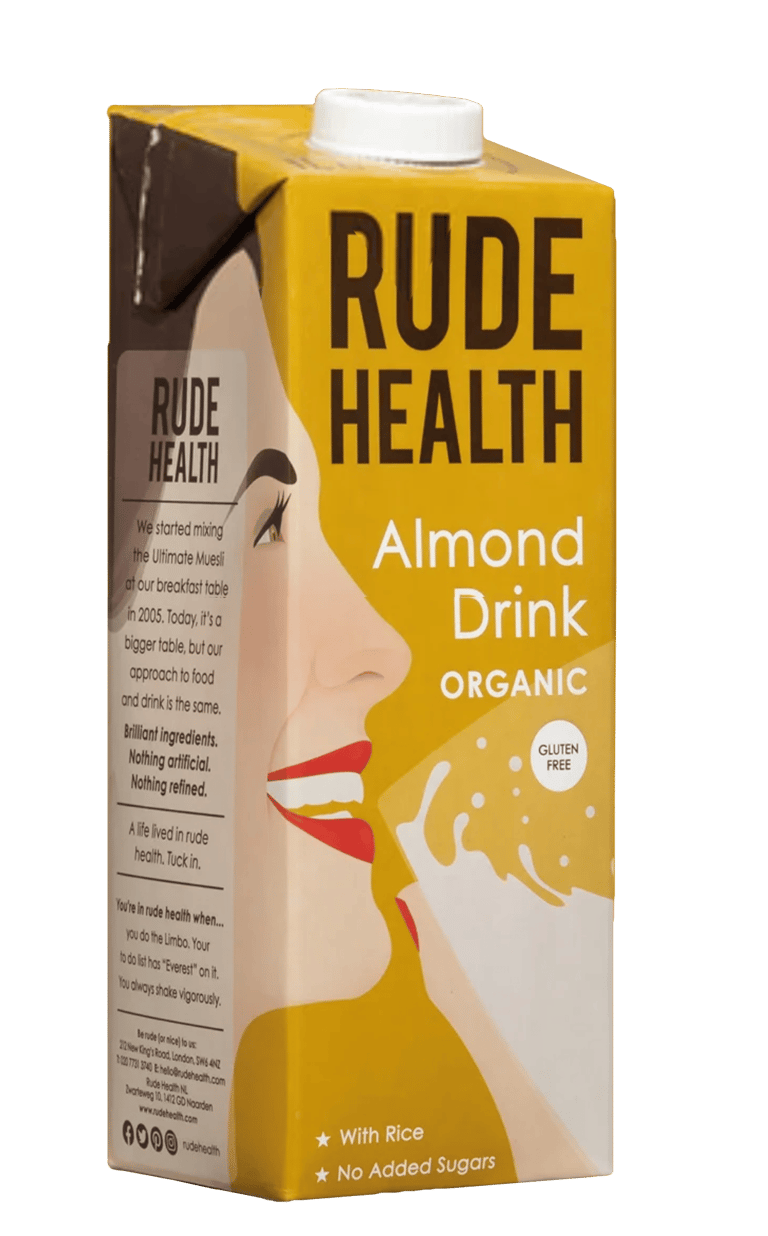


not polite, offensive (according to Oxford Dictionary
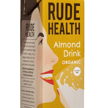
There is nothing really rude about the illustration on the packaging.Could do with something more fun and perhaps a bit gimicky like a rude little character.



Organic, Vegan, Gluten Free
Those expressions ask for a more natural look - soft edges with imperfections and grainy textures.
The main ingredient could be visible at first sight


The illustration wraps around the container which can look a bit distorted from certain angles.

ALMOND
OAT
COCONUT
SOY
BROWN RICE
CASHEW
HAZELNUT
TIGERNUT
ORGANIC BARISTA NO SUGARS

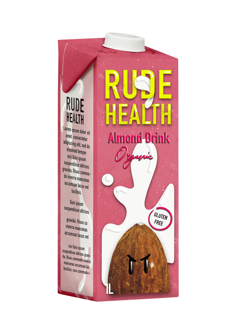
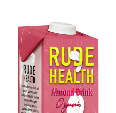
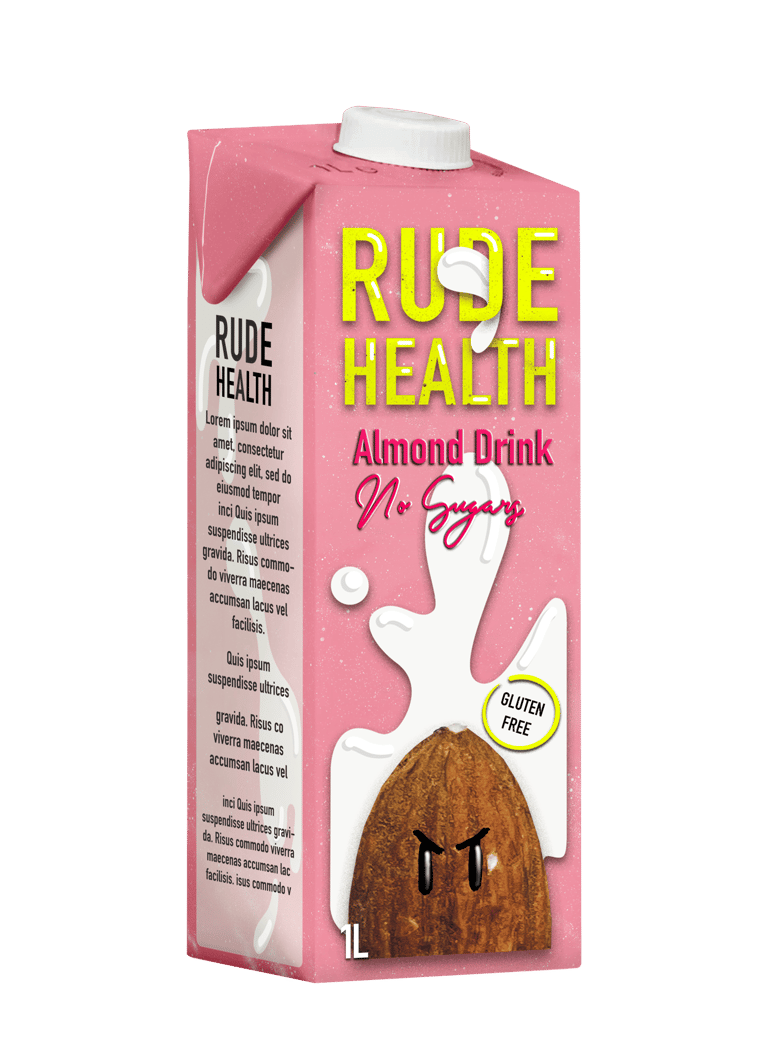
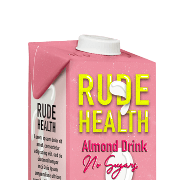
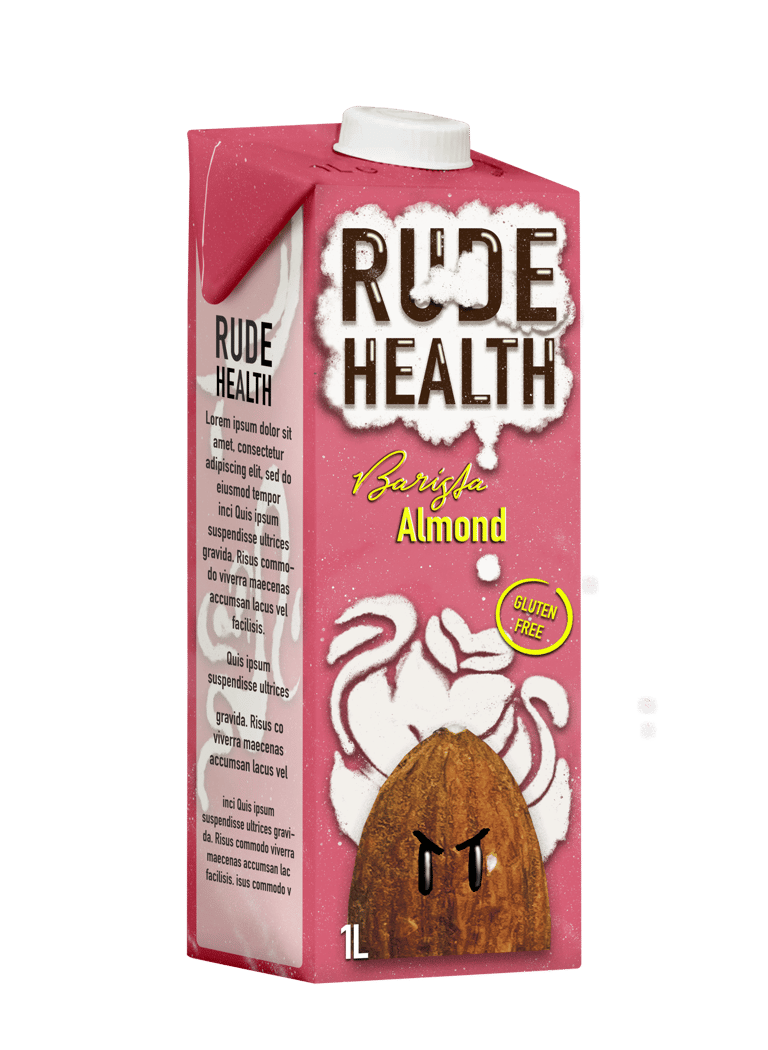
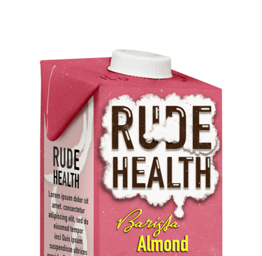



NEW DESIGN

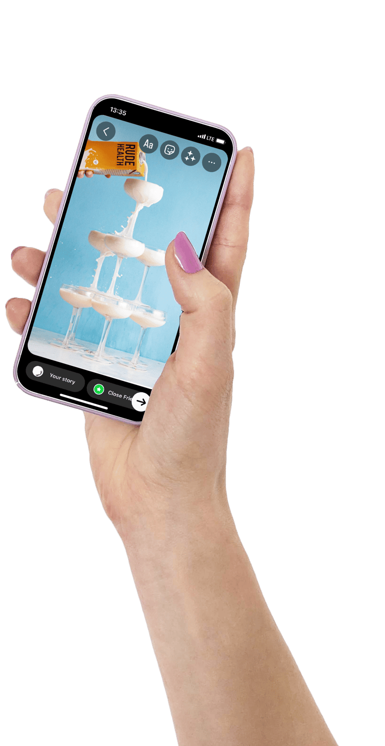
ANIMATED GIFS FOR SOCIAL MEDIA


